Statistics is a branch of mathematics that deals with collecting, analyzing, interpreting, presenting, and organizing data. There are several key statistical calculations and formulas used in various aspects of data analysis. Here are some fundamental ones:
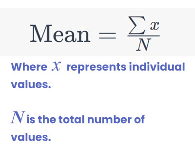
Mean (Average):
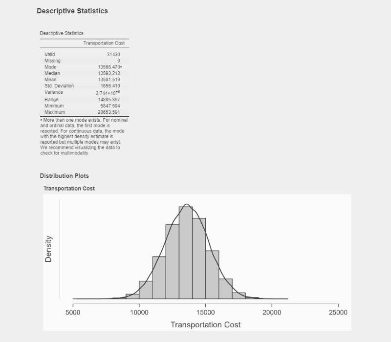
The mean is the sum of all values in a dataset divided by the number of values.
Median:
The median is the middle value in a sorted dataset. If the dataset has an odd number of values, the median is the middle one. If it has an even number of values, the median is the average of the two middle values.
Mode:
The mode is the value that appears most frequently in a dataset.
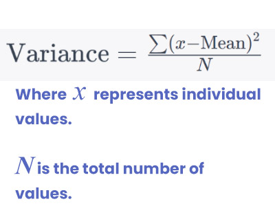
Variance:
Variance measures how spread out the values in a dataset are.
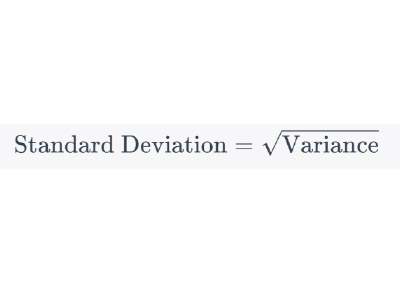
Standard Deviation:
Standard deviation is the square root of the variance and gives a measure of the amount of variation or dispersion of a set of values.
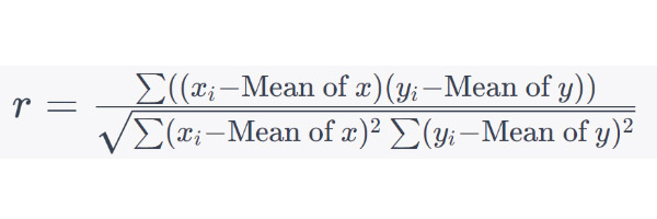
Correlation Coefficient (r):
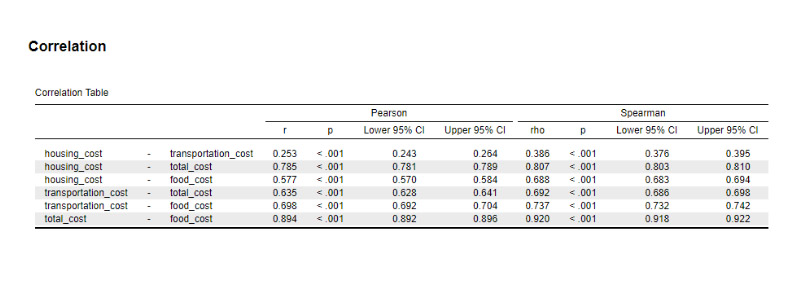
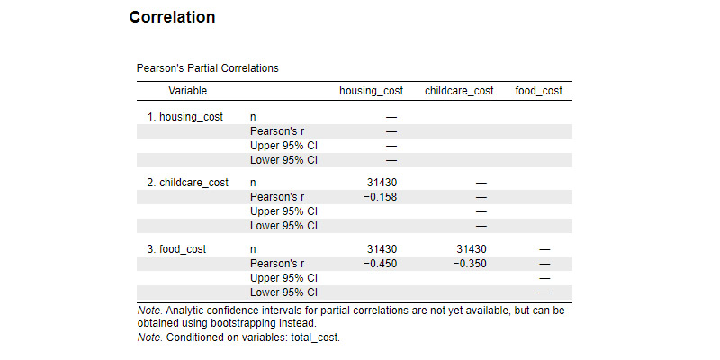
Correlation coefficient measures the strength and direction of a linear relationship between two variables. It ranges from -1 to 1.
Regression Line Equation:
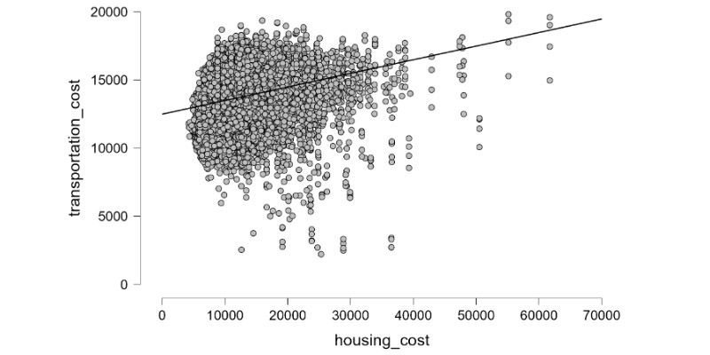
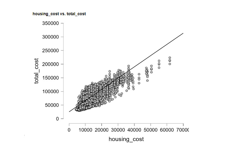
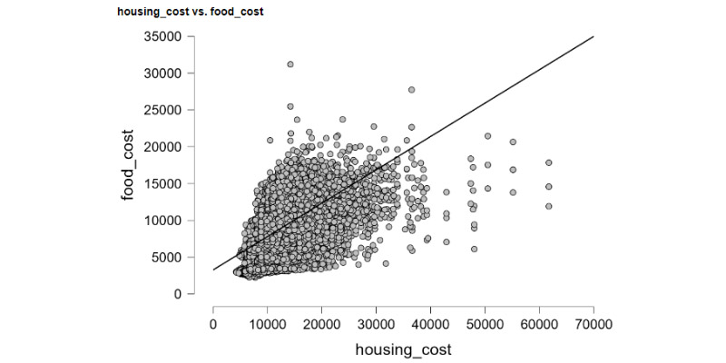
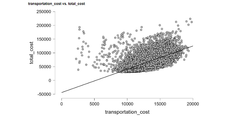
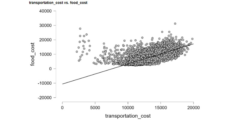
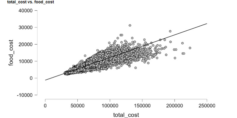
In linear regression, the equation of the regression line (y = mx + b) represents the relationship between the independent variable (x) and the dependent variable (y) where m is the slope and b is the y-intercept.
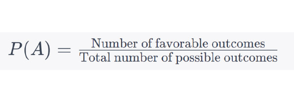
Probability (P):
Probability measures the likelihood of an event occurring. It ranges from 0 (impossible event) to 1 (certain event).
These are just a few basic formulas. Statistics encompasses a wide range of concepts and techniques, including hypothesis testing, ANOVA, chi-square tests, and more, each with its specific formulas and calculations. The choice of which formula to use depends on the nature of the data and the research question being addressed.
Regression Line Equation:
In linear regression, the equation of the regression line (y = mx + b) represents the relationship between the independent variable (x) and the dependent variable (y) where m is the slope and b is the y-intercept.
Normal distribution charts
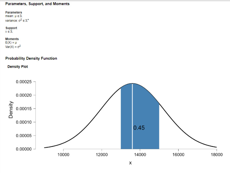
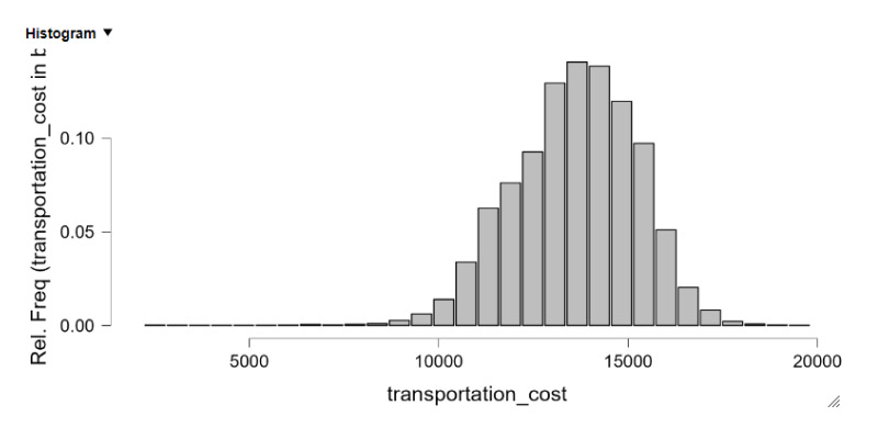
Normal distribution charts, also known as bell curves or Gaussian curves, are essential tools in statistics for visualizing and analyzing data that follows a normal distribution pattern. Here’s how you can use statistics to create and interpret normal distribution charts:
1. Collect Data: Begin by collecting your data points. Ensure that the data is continuous and covers a wide range. The more data points you have, the more accurate your normal distribution chart will be.
2. Calculate Mean and Standard Deviation: Calculate the mean (μ) and standard deviation (σ) of your data set. The mean represents the center of the distribution, while the standard deviation measures the spread of the data around the mean.
3. Construct the Normal Distribution Curve: Using the calculated mean and standard deviation, you can create the normal distribution curve. The formula for the normal distribution function (also called probability density function) is:
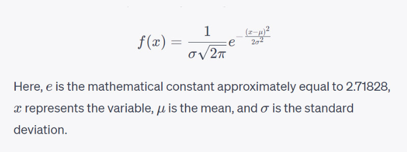
4. Plot the Data: Plot the calculated values on a graph with the x-axis representing your data points and the y-axis representing the probability density function values obtained from the formula. This will create the familiar bell curve shape.
5. Interpretation:
- Symmetry: A normal distribution is symmetrical around its mean.
- Mean and Median: In a normal distribution, the mean, median, and mode are all equal and located at the center of the distribution.
- 68-95-99.7 Rule: In a normal distribution, approximately 68% of the data falls within ±1 standard deviation of the mean, 95% falls within ±2 standard deviations, and 99.7% falls within ±3 standard deviations. This is often referred to as the empirical rule.
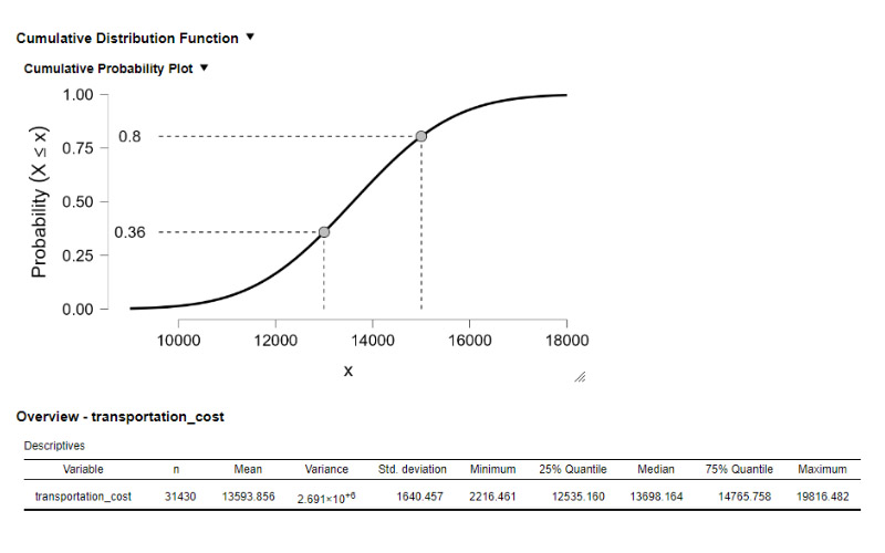
6. Z-Score and Probability Calculation: You can use the Z-score formula to calculate the probability of a specific value occurring in a normal distribution. The Z-score represents how many standard deviations a data point is from the mean:
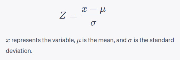
You can then use statistical tables or software to find the probability associated with a specific Z-score, indicating the likelihood of observing a value below or above a certain point in the distribution.
By following these steps and understanding the underlying statistics, you can effectively create and interpret normal distribution charts, gaining valuable insights into your data’s patterns and probabilities.
JASP (Jeffreys’s Amazing Statistics Program) is an open-source statistical software that offers a user-friendly interface for both beginners and experienced researchers. One of its notable features is its emphasis on Bayesian statistics, making it a popular choice among those interested in this approach. JASP allows users to conduct a wide range of analyses, including t-tests, ANOVA, regression, and Bayesian methods, with intuitive point-and-click functionalities. Its visually appealing and interactive graphs aid in the interpretation of results, making complex statistical analyses more accessible.
